The nicest Sears store you may ever see.... in Danbury, CT.
Photo Credit: Michael Parisi
I was contacted by Michael Parisi, who often sends us some photos from the Nutmeg State. When I saw these photos of Sears, I nearly fell out of my seat. This store looks AMAZING! If every Sears looked like this, Sears wouldn't be in a financial crisis and have a bad image or be cutting corners. This store makes you want to shop at Sears!! A little backstory...
February 2015, Sears announced it would lease out 70,000 square feet to Primark, a European retailer who is opening stores in several states. This would cut the size of the store down significantly, but would also give it a fresh new look.
Article: http://www.newstimes.com/business/article/Danbury-mall-gets-a-new-anchor-6090330.php
July 2016, Sears has a whole new look. You may not even think this can be a Sears, but it is! The store is only 58,000 square feet, but how much space do department stores need now a days? It had a grand re opening that even featured a US Senator!
Article: http://www.newstimes.com/business/article/Renovation-gives-Sears-a-fresh-look-at-Danbury-8348208.php#photo-10504803
So are you curious yet as to what it looks like? I certainly hope so!





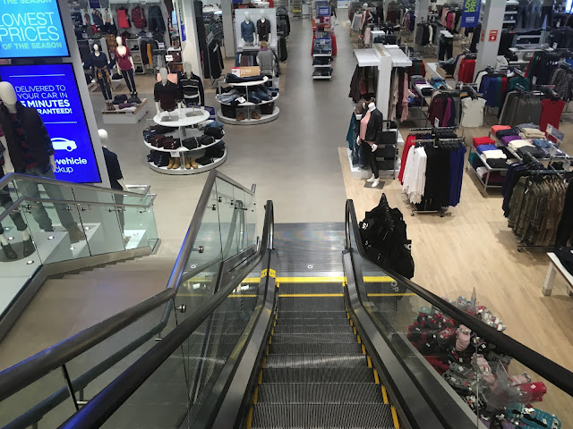


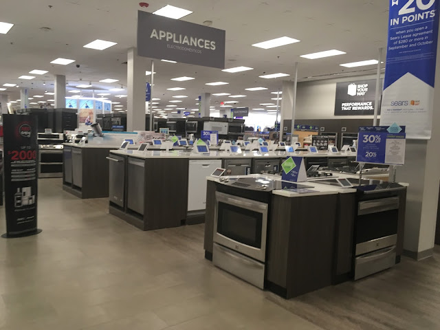
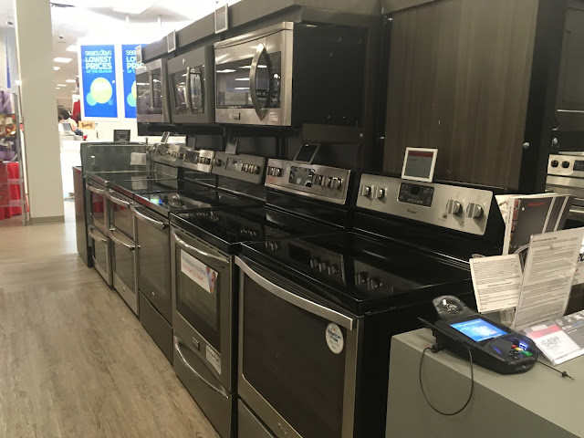
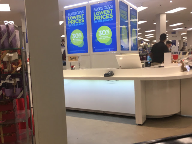
Nicest Sears in USA maybe. Most Sears in Mexico are a lot better that this in Ct.
ReplyDeleteIt looks better than the ghetto Sears in most places here in SE FL. Even at the "upscale" Boca Town Center, the Sears store there needs a serious refresh.
ReplyDeleteIf Eddie Lampert had half a clue what he was doing (or alternately, wasn't trying to run Sears/Kmart into the ground); he'd be using this Sears as a model for refreshing the stores.
ReplyDeleteHe might be though. It seems recently a ton of Sears stores are ownsiing to a store like this, or closing and sometimes getting replaced by a appliance store like Ft. Colins
DeleteThey are currently remodeling/downsizing/reshaping the Albuquerque Coronado Center Sears to this prototype. They spent months doing a clearance sale, and are now in the final stages of interior remodeling of the space, with ongoing construction to reconfigure 100,000+ square feet of the original store into new mall space.
ReplyDeleteThere's some more photos of this store on Flickr taken by styertowne. One thing that is interesting is that this Sears seems to have maintained a fairly decently sized electronics department in a fairly prime space in the store even though Sears has been deemphasizing electronics at most stores and has almost totally eliminated them at some smaller stores. It's good to see Sears maintain this location as a full-line store even with the downsizing. Also, the fact that electronics stuck around at this significantly remodeled store is a good sign that they will stick around at other higher performing stores.
ReplyDeleteThis store looks a bit bland with the gray flooring (I'm a fan of the more carpeted 1990s Sears designs) and the basic department signage that looks more discount store-like than department store, but the store does look pretty good and clean. I won't hold my breath waiting for this, but hopefully Sears can put these renovations in other higher performing stores. That will give customers a sense that Sears is a more modern, upscale store even if some of the current stores that have 1990s interiors still look pretty nice.
The Sears store with the nicest interior that I've actually been to in recent years would be the Baybrook Mall Sears in SE Houston. I'm not sure when the store was last totally renovated, but the clothing departments have a more upscale department store-like feel than most Sears stores. The sporting goods department must have been renovated somewhat recently. It's modeled to look like a gym and looks really good. The store received new signage with the current Sears logo in 2012 or 2013. The Plaza Paseo (formerly known as Pasadena Town Square) Sears in the Houston area also looks quite nice. It's a late 1990s Sears and has a similar exterior and interior to other full-line Sears stores from that era. Unlike in other eras, I guess Sears decided to go for standardized store designs in the 1990s.
Anyway, thanks for the article and pictures of this Sears. I'd certainly love to see more coverage of Sears stores on this blog.